- Section
- Troubleshooting: Missing Icons
- Spectra Patterns
- Contact Form 7: Multiple Column Fields
- Contact Form 7: Checkbox / Radio / Acceptance Control
- Unable To Style Contact Form 7
- Tab Index For Multiple Gravity Forms
- Getting Started With Spectra
- Exclude Heading From TOC
- Block Display Conditions
- Importing Starter Templates With Spectra
- Getting Started With Spectra
- Manually Install Spectra Via FTP
- Automatic Beta Updates
- Rollback To Previous Versions
- Load Google Fonts Locally
- Activate Spectra Pro License
- Install Spectra Pro
- Translate Strings With Loco Translate
- Process Refund Requests
- Transparent / Sticky Header
- Change Site Logo
- Change Global Styles
- Disable Title on Posts & Pages
- Transparent / Sticky Header For Single Page / Post
- Change Header & Footer Patterns
- Custom / Google Fonts
- Reset Global Default Styling
- Manually Install Spectra One Via FTP
- Enable / Disable Header & Footer On Specific Pages / Posts
- Container
- Buttons
- List
- Modal
- Slider In Spectra
- Animations In Spectra
- Icons
- Tabs In Spectra
- Text Block In Spectra
- Countdown In Spectra
- Loop Builder
- Image Mask In Spectra
- Dynamic Content In Spectra
- Global Styles In Spectra
- Accordion In Spectra
- Responsive Control In Spectra
- Font Management In Spectra
- Google Maps
- Separator
- Getting Started With Spectra
- Public Actions and Hooks In Spectra
- Popup Builder In Spectra
- Counter Block In Spectra
- Login Block in Spectra
- Register Block In Spectra
- Spectra Design Library Guide
- How to Enable Spectra 3 Beta
- Preview Options in Spectra (Desktop, Tablet & Mobile)
Container
Introduction
The Container Block is a powerful layout block that serves as the foundation for creating complex page layouts in WordPress. It goes beyond the standard Group block by offering advanced styling options, pre-built layout variations, background media support, and responsive controls. Use it to create sections, columns, grids, and sophisticated page structures with ease.
How to Add or Use the Block in the Gutenberg Editor
- Adding the Block
- Click the “+” button in the editor to open the block inserter
- Search for “Container” or navigate to the Spectra category
- Click on the Container Block to add it
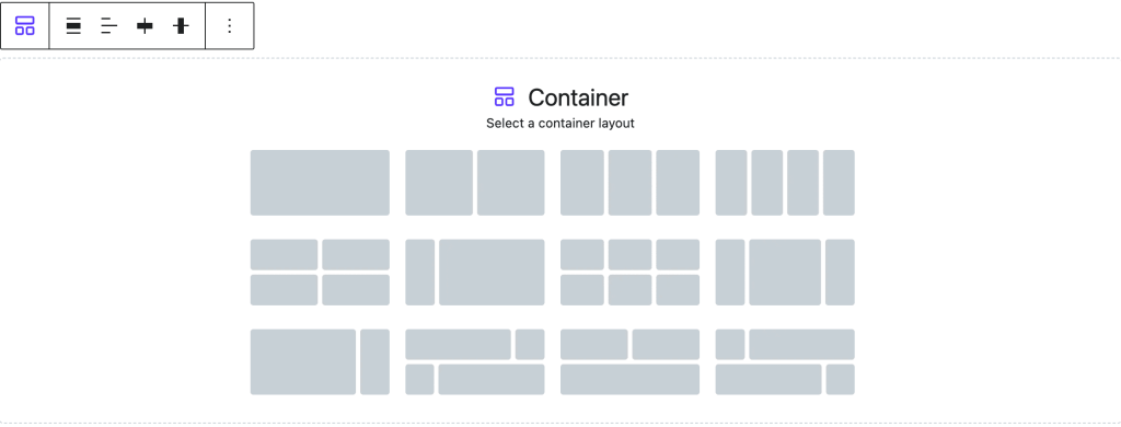
- Choosing a Layout Variation
- Upon adding, you’ll see a variation picker with 12 pre-built layouts
- Options include: 1-column, 2-column (50-50), 3-column, 4-column, and complex grids
- Select a variation or start with a blank container
- You can change the layout later using the toolbar
- Adding Content to Container
- Click inside the container to add blocks
- Use the “+” button to add any block type
- Containers can be nested for complex layouts
Settings Panel Organization

The Container Block settings follow the editor panel structure. Here’s what you’ll find in each section:
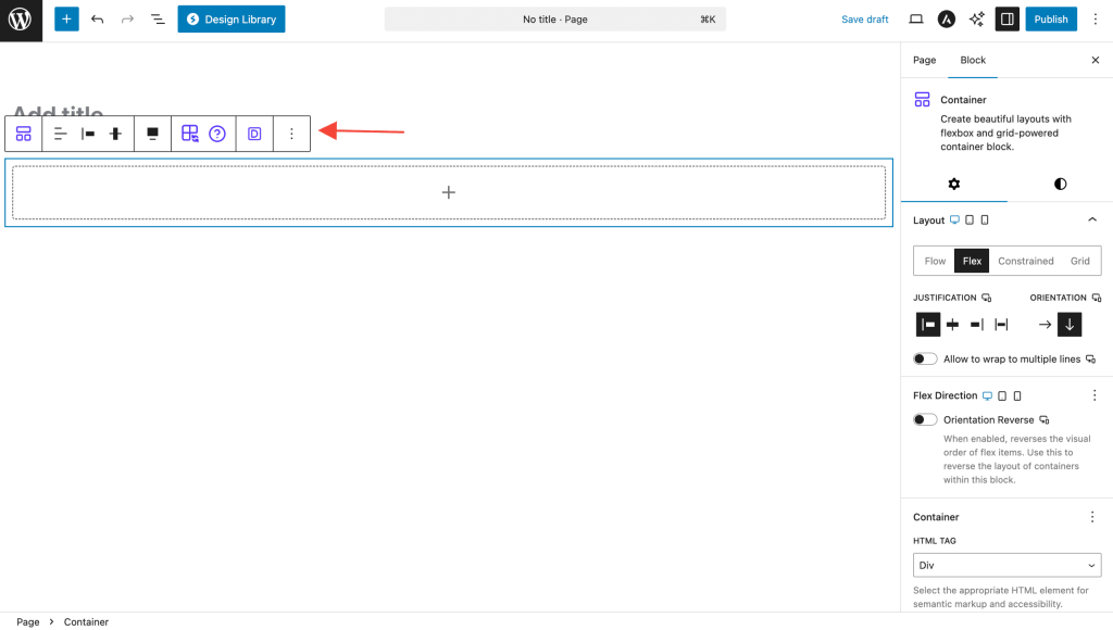
Layout Tab
Layout Settings
Choose how your content is arranged inside the container:
Flow Layout
What it is: Content flows naturally from top to bottom, like a normal document.
When to use:
- Simple content sections
- Text with images
- Basic page layouts
How it works: Items stack vertically in the order you add them. No special alignment needed.
Flex Layout
What it is: Gives you control over how items line up and space out.
When to use:
- Side-by-side content
- Centering items
- Equal spacing between elements
Key controls:
- Direction: Arrange items left-to-right (Row) or top-to-bottom (Column)
- Align: Position items vertically – top, center, bottom, or stretch
- Justify: Space items horizontally – start, center, end, or spread out
- Gap: Add consistent space between all items
Grid Layout
What it is: Creates a precise grid with defined rows and columns.
When to use:
- Complex layouts with specific positioning
- Card layouts
- Magazine-style designs
How it works: Define exact rows and columns, then place items anywhere on the grid.
Constrained Layout
What it is: Centers content and limits its maximum width.
When to use:
- Main content areas
- Reading-focused sections
- Consistent page width
How it works: Content stays centered and never gets too wide, even on large screens.
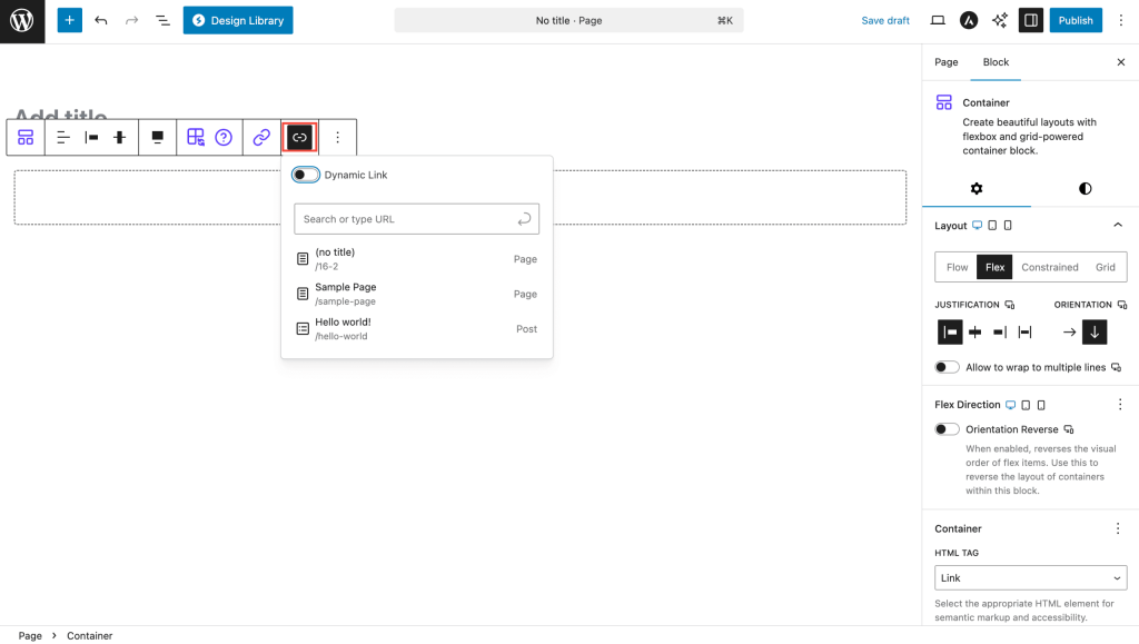
Container Settings
HTML Tag Choose the right HTML element for your container:
- div – General container (default)
- header – Page or section header
- footer – Page or section footer
- main – Main page content
- section – Distinct page section
- article – Standalone content
- aside – Sidebar content
- nav – Navigation area
Make Container a Link Turn your entire container into a clickable area. Perfect for feature cards or call-to-action sections.
Global Styles
Apply your theme’s design system:
- Use consistent colors across your site
- Apply predefined spacing values
- Maintain brand consistency
Animation
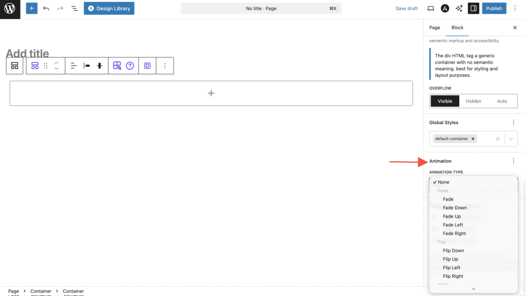
Add entrance animations:
- Fade in – Gradually appear
- Slide up/down/left/right – Enter from a direction
- Zoom in/out – Scale into view
- Custom timing – Control speed and delay
Advanced
Technical options for developers:
- Custom CSS classes
- HTML anchor for direct linking
- Advanced responsive controls
Styles Tab
Color
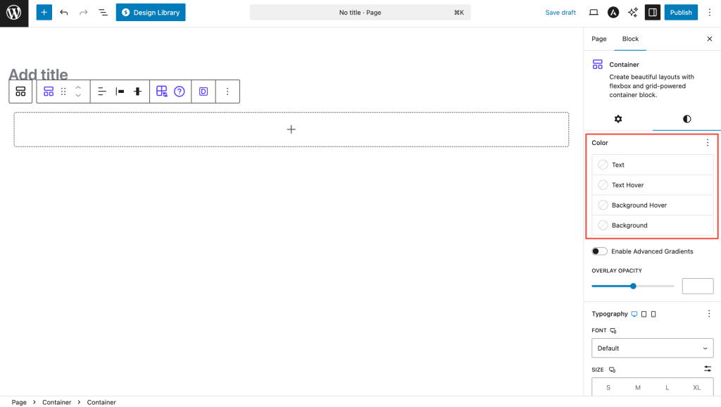
Set colors that affect all content inside:
Text Color – Default color for all text inside the container Link Color – Color for all links within the container Background Color – Solid background color behind content Background Gradient – Gradient background with multiple colors Text Hover – Text color when hovering over container (if container is a link) Background Hover – Background color change on hover
Typography
Control default text appearance for all content inside:
- Font family – Choose from available fonts
- Font size – Set base text size
- Font weight – Light, normal, bold, etc.
- Line height – Space between lines of text
- Letter spacing – Space between characters
All typography settings are responsive – set different values for desktop, tablet, and mobile.
Dimensions
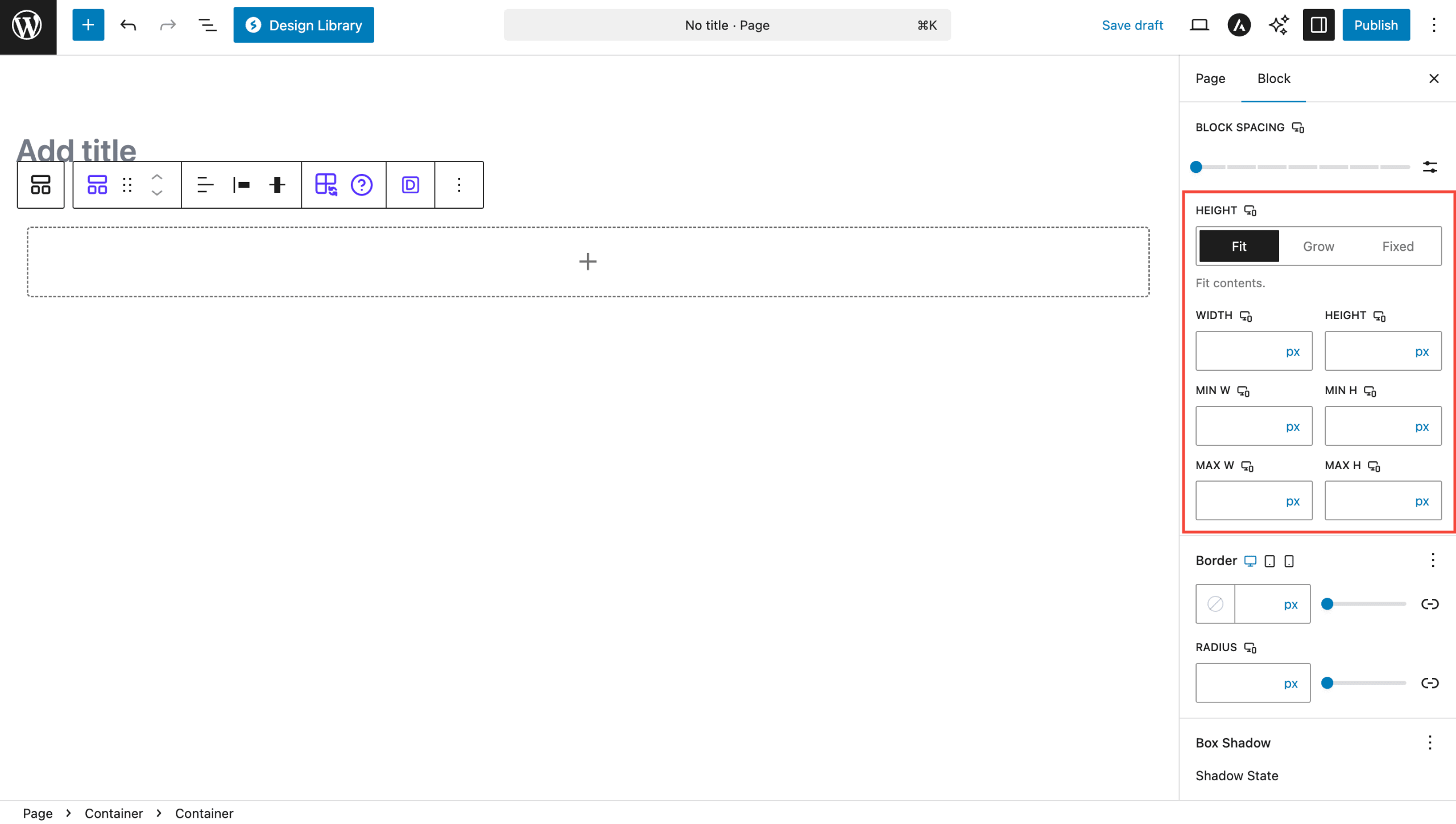
Width & Height Set container size using:
- px – Exact pixels
- % – Percentage of parent
- vw/vh – Percentage of viewport (screen)
- em/rem – Based on text size
Constraints
- Min Width/Height – Smallest the container can be
- Max Width/Height – Largest the container can be
- Overflow – What happens if content doesn’t fit:
- Visible – Content spills out
- Hidden – Content gets cut off
- Auto – Scrollbars appear if needed
Border & Shadow

Border
- Set border thickness, style (solid, dashed, dotted), and color
- Control corner roundness individually for each corner
- Different settings for each device size
Shadow
- Add depth with drop shadows
- Control shadow color, blur amount, and spread
- Create multiple shadow layers
- Use inset shadows for recessed effects
Background Media Usage
Setting Up Background Media
- Select the Container Block
- Choose Background Type in the Background settings panel:
- None: No background media
- Image: Upload images with position, size, and repeat controls
- Video: Upload MP4 videos for dynamic backgrounds
- Upload Your Media
- Click “Add background image/video” button
- Select from Media Library or upload new media
- Image recommendations: Use WebP format, optimize for web
- Video recommendations: MP4 format, <10MB, no audio for autoplay
- Configure Media Settings
- For Images: Adjust position (focal point), size (cover/contain/auto), and repeat options
- For Videos: Video will autoplay and loop automatically
- Add Overlay (Optional)
- Use overlay color/gradient for better text readability
- Adjust overlay opacity from 0-100%
Layout Variations
When you first add a Container block, you can choose from these pre-built layouts:
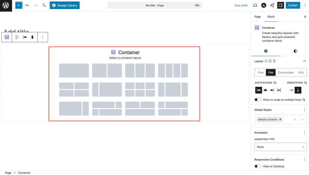
Simple Layouts
Perfect for beginners:
One Column – Full-width single column for basic content Two Columns 50-50 – Two equal columns side by side Three Columns – Three equal columns for features or services Four Columns – Four equal columns for cards or testimonials
Advanced Layouts
For more complex designs:
Two Column Two Row – Grid layout with rows and columns 25-75 Split – Narrow sidebar with wide content area 75-25 Split – Wide content with narrow sidebar 25-50-25 – Three columns with emphasis on center Complex Grid – Multi-row, multi-column combinations
You can switch between any variation after adding the block using the toolbar.
Block Toolbar Options
Quick actions available in the toolbar:
- Change Layout – Switch to a different variation
- Transform – Convert to Group or other blocks
- Alignment – Make container wide or full-width
- Drag Handle – Move the container
- Options Menu – More settings and actions
Advanced Features
Container as Link
Make your entire container clickable – great for feature cards or call-to-action sections:
How to set up:
- In Container settings, change HTML tag to “Link”
- Enter your URL
- Choose if link opens in new tab
- Set up hover effects for better user experience
Link options:
- URL – Where the link goes
- Target – Same window or new tab
- Rel attributes – For SEO and security (nofollow, noopener, etc.)
Hover Effects
Make your containers interactive:
- Background changes – Different colors on hover
- Text changes – Different text colors on hover
- Smooth transitions – Animated color changes
- Works with links – Perfect for clickable containers
Common Use Cases
Hero Sections – Full-width container with video background and centered text
Content Sections – Constrained layout with max-width for readability
Feature Grids – Multi-column layouts showcasing services or products
Call-to-Action Blocks – Container as link with hover effects
Image/Text Combinations – Two-column layouts mixing media and content
Device-Specific Settings
Most Container settings work across all device sizes:
| Setting | Desktop | Tablet | Mobile |
|---|---|---|---|
| Width/Height | ✓ | ✓ | ✓ |
| Padding/Margin | ✓ | ✓ | ✓ |
| Typography | ✓ | ✓ | ✓ |
| Border | ✓ | ✓ | ✓ |
| Gap | ✓ | ✓ | ✓ |
Use the device switcher in the editor to set different values for different screen sizes.
Tips and Best Practices
Design Guidelines
- Consistent spacing – Use the same padding values across similar containers
- Mobile-first – Design for mobile screens first, then enhance for larger screens
- Semantic HTML – Use appropriate tags (header, main, footer, section) for better SEO
- Content hierarchy – Use Container blocks to create clear content sections
Performance Tips
- Optimize media – Compress background images, use WebP format when possible
- Video sizes – Keep background videos under 10MB for faster loading
- Minimize nesting – Don’t nest containers too deeply
- Test on mobile – Always check how your containers look on small screens
Troubleshooting
Common Issues
Background video not playing?
- Check file format (MP4 works best)
- Ensure file size is under 10MB
- Some mobile browsers block autoplay videos
Border radius not working with backgrounds?
- Set Overflow to “Hidden” in container settings
- This clips the background to match the border shape
Content overflowing container?
- Check your Overflow setting (try “Auto” for scrollbars)
- Verify height settings aren’t too restrictive
- Test on mobile devices
Nested containers not working properly?
- Make sure parent container has proper layout settings
- Check that child containers have appropriate dimensions
- Avoid nesting too many levels deep
Frequently Asked Questions
Q: What’s the difference between Container and Group blocks?
A: Container offers advanced features like video backgrounds, layout variations, hover states, dimension controls, and can act as a clickable link.
Q: Can I nest containers inside each other?
A: Yes! You can nest containers to create complex layouts. Each container maintains its own settings.
Q: How do I make a full-height hero section?
A: Set Height to 100vh in the dimension settings. Consider using Min Height for better mobile experience.
Q: Can I use Container for headers and footers?
A: Absolutely! Change the HTML tag to ‘header’ or ‘footer’ for semantic correctness and better SEO.
Q: Why isn’t my background video showing on mobile?
A: Many mobile browsers restrict video autoplay to save battery and data. Consider providing a fallback background image.
Q: How do I center content vertically?
A: Use Flex layout, set Direction to Column, and choose “Center” for both Align Items and Justify Content.
Compatibility and Requirements
System Requirements
- WordPress 6.6.0 or higher
- PHP 8.1 or higher
- Modern browsers with CSS Grid and Flexbox support
Performance Considerations
- Optimize background images (WebP format recommended)
- Keep video backgrounds under 10MB
- Use lazy loading for off-screen containers
- Minimize nesting depth for better performance
- Test on various devices and connection speeds
We don't respond to the article feedback, we use it to improve our support content.