- Section
- Troubleshooting: Missing Icons
- Spectra Patterns
- Contact Form 7: Multiple Column Fields
- Contact Form 7: Checkbox / Radio / Acceptance Control
- Unable To Style Contact Form 7
- Tab Index For Multiple Gravity Forms
- Getting Started With Spectra
- Exclude Heading From TOC
- Block Display Conditions
- Importing Starter Templates With Spectra
- Getting Started With Spectra
- Manually Install Spectra Via FTP
- Automatic Beta Updates
- Rollback To Previous Versions
- Load Google Fonts Locally
- Activate Spectra Pro License
- Install Spectra Pro
- Translate Strings With Loco Translate
- Process Refund Requests
- Transparent / Sticky Header
- Change Site Logo
- Change Global Styles
- Disable Title on Posts & Pages
- Transparent / Sticky Header For Single Page / Post
- Change Header & Footer Patterns
- Custom / Google Fonts
- Reset Global Default Styling
- Manually Install Spectra One Via FTP
- Enable / Disable Header & Footer On Specific Pages / Posts
- Container
- Buttons
- List
- Modal
- Slider In Spectra
- Animations In Spectra
- Icons
- Tabs In Spectra
- Text Block In Spectra
- Countdown In Spectra
- Loop Builder
- Image Mask In Spectra
- Dynamic Content In Spectra
- Global Styles In Spectra
- Accordion In Spectra
- Responsive Control In Spectra
- Font Management In Spectra
- Google Maps
- Separator
- Getting Started With Spectra
- Public Actions and Hooks In Spectra
- Popup Builder In Spectra
- Counter Block In Spectra
- Login Block in Spectra
- Register Block In Spectra
- Spectra Design Library Guide
- How to Enable Spectra 3 Beta
- Preview Options in Spectra (Desktop, Tablet & Mobile)
Preview Options in Spectra (Desktop, Tablet & Mobile)
Spectra allows you to preview and adjust your design for Desktop, Tablet, and Mobile without leaving the editor.
Why Preview Options Matter
Your website is viewed on different screen sizes:
- Desktop (laptops and large screens)
- Tablet (iPads and medium screens)
- Mobile (phones)
A layout that looks perfect on desktop can easily break on mobile.
Preview options help you:
- Check how your layout adapts on different devices
- Adjust spacing, font sizes, and alignment per device
- Avoid broken or unreadable layouts on mobile
Where to Find Preview Options
In the WordPress block editor:
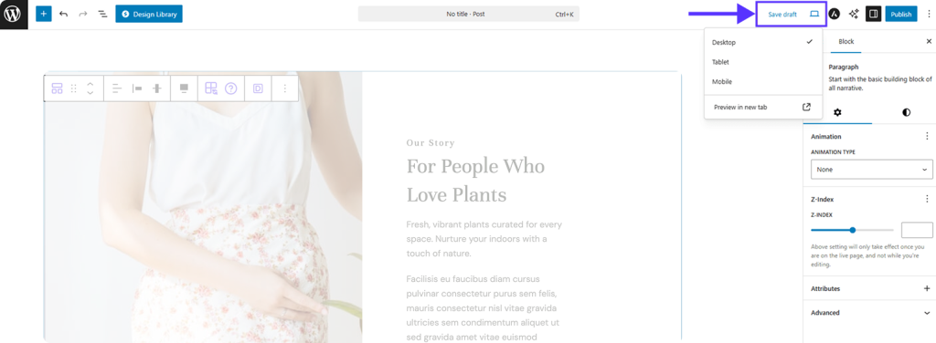
- Look at the top-right corner of the editor toolbar
- Click the Preview icon (screen icon)
- A dropdown will open with these options:
- Desktop
- Tablet
- Mobile
- Preview in new tab
Selecting Desktop, Tablet, or Mobile changes the editor canvas size.
Desktop Preview
What it Represents
- Large screens (laptops and desktops)
- This is the default view when you open the editor
When to Use It
- Designing overall layout structure
- Setting default font sizes
- Aligning sections and columns
Important to Know
- Desktop settings act as the base styles
- Tablet and mobile settings override desktop styles when needed
Tablet Preview
What it Represents
- Medium-sized screens (tablets, iPads)
- Width is smaller than desktop but larger than mobile
When to Use It
- Adjusting column stacking
- Reducing spacing or font sizes
- Fixing elements that look cramped
Example Adjustments
- Change 3-column layout to 2 columns
- Reduce padding
- Center-align text
Mobile Preview
What it Represents
- Small screens (phones)
- Limited horizontal space
When to Use It
- Ensuring text is readable
- Making buttons easy to tap
- Avoiding horizontal scrolling
Example Adjustments
- Stack columns vertically
- Increase button size
- Reduce heading font size
How Responsive Controls Work in Spectra
Many Spectra block settings have device-specific icons next to them:
- Desktop icon
- Tablet icon
- Mobile icon
How to Use Them
- Switch to Tablet or Mobile preview
- Click the device icon next to a setting (e.g. font size, padding)
- Adjust the value
That change applies only to that device.
Common Beginner Mistakes (Avoid These)
❌ Designing only in desktop view
❌ Forgetting to check mobile preview
❌ Overwriting mobile styles while still in desktop mode
❌ Assuming WordPress automatically fixes mobile layouts
Spectra gives you control, but you must use it.
Best Practice for New Users
Follow this order:
- Design your layout in Desktop
- Switch to Tablet and fix spacing/layout issues
- Switch to Mobile and optimize readability
Always preview all three before publishing.
If your site looks good on all three previews, you’re doing it right!
We don't respond to the article feedback, we use it to improve our support content.