- Section
- Troubleshooting: Missing Icons
- Spectra Patterns
- Contact Form 7: Multiple Column Fields
- Contact Form 7: Checkbox / Radio / Acceptance Control
- Unable To Style Contact Form 7
- Tab Index For Multiple Gravity Forms
- Getting Started With Spectra
- Exclude Heading From TOC
- Block Display Conditions
- Importing Starter Templates With Spectra
- Getting Started With Spectra
- Manually Install Spectra Via FTP
- Automatic Beta Updates
- Rollback To Previous Versions
- Load Google Fonts Locally
- Activate Spectra Pro License
- Install Spectra Pro
- Translate Strings With Loco Translate
- Process Refund Requests
- Transparent / Sticky Header
- Change Site Logo
- Change Global Styles
- Disable Title on Posts & Pages
- Transparent / Sticky Header For Single Page / Post
- Change Header & Footer Patterns
- Custom / Google Fonts
- Reset Global Default Styling
- Manually Install Spectra One Via FTP
- Enable / Disable Header & Footer On Specific Pages / Posts
Sticky Container
What Is This?
Sticky Container keeps your container blocks fixed in place as visitors scroll. Perfect for navigation menus, call-to-action buttons, or any content you want to stay visible.
Just toggle to stick. No coding needed.
How To Use
- Select a Container block in the editor (the one you want to stick)
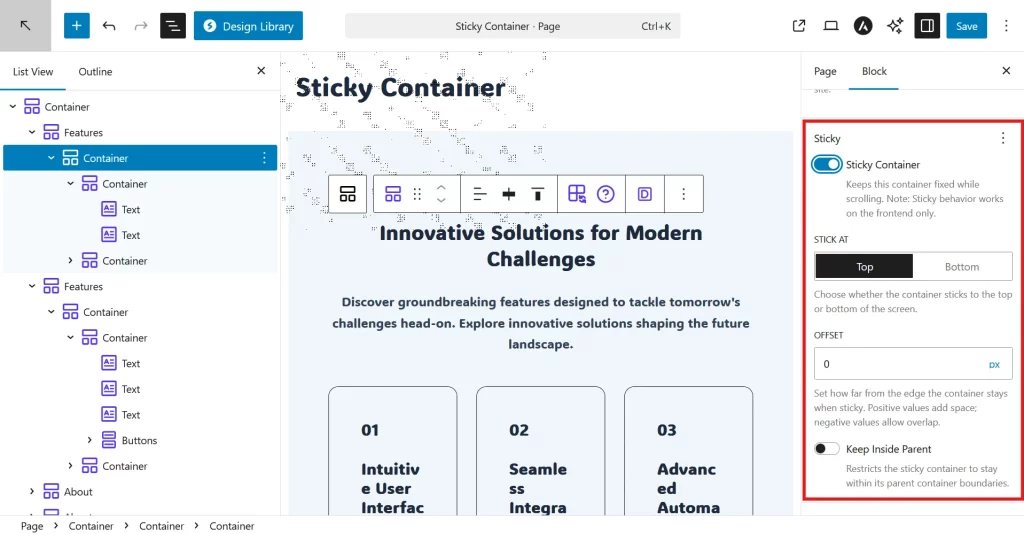
- Open the Settings panel on the right sidebar (click the gear icon ⚙️ if hidden)
- Scroll down and find “Sticky” panel
- Click to expand the Sticky panel
- Toggle “Sticky Container” to ON
- Choose where to stick:
- Top – Sticks to top of screen as you scroll down
- Bottom – Sticks to bottom of screen as you scroll up
- Set Offset (optional) – Add spacing if needed (see below for details)
- Click “Update” or “Publish” to save your changes
- View your page in a new tab to see it working (won’t work in editor)
Important: Sticky only works on your live website, not in the editor. After saving, open your page in a new browser tab and scroll to see it stick.
Settings Explained
Sticky Container Toggle
Turn sticky on or off. When enabled, your container will stick to the screen while scrolling.
Stick At
Choose where to stick:
- Top – Container sticks to top of screen
- Bottom – Container sticks to bottom of screen
Offset
Control spacing from the screen edge.
Offset sets how far from the screen edge your sticky container sits.
When sticking to TOP:
0px– Flush against top edge (no gap)80px– Sits 80px below the top edge (use if you have a header above it)-20px– Overlaps the top by 20px (negative = overlap)
When sticking to BOTTOM:
0px– Flush against bottom edge20px– Sits 20px above the bottom edge-10px– Overlaps the bottom (floats slightly off-screen)
Supported units: px, rem, em, %, vh, vw
Common scenarios:
- No other sticky elements: Use
0px - Have a sticky header above: Set offset to your header’s height (e.g.,
80px) - Want breathing room: Use
20pxto40px - Responsive spacing: Use
5vh(5% of screen height)
Keep Inside Parent
Stop sticky at section boundaries.
When enabled, your sticky element stops scrolling when it reaches the bottom of its parent section.
When to use:
- Sidebar widgets that should stop at article end
- Sticky elements inside specific sections
- Content that shouldn’t scroll past its container
How to enable:
- Only available when “Stick at Top” is selected
- For nested containers: Shows automatically
- For other containers: Click the three dots (⋮) at top-right of Sticky panel, then enable this option
What’s a “nested container”? A container inside another container. Example: A sidebar container inside a main section container.
When To Use
Sticky Navigation:
- Header menus that stay visible
- Sidebar navigation that follows scroll
- Table of contents while reading
Call-to-Action:
- Signup buttons at bottom of screen
- “Buy Now” buttons that follow visitors
- Newsletter signup that stays visible
Sidebars:
- Related articles while reading
- Share buttons that stick
- Author bio boxes
Announcements:
- Promotional banners at top
- Cookie notices at bottom
- Sale announcements
Tips & Best Practices
Testing:
- Always test on live site – Sticky doesn’t work in the editor
- Test while scrolling – Scroll slowly and quickly to check behavior
- Check on mobile – Use your phone to verify it works on small screens
- Test with different content lengths – Make sure it works with short and long pages
Common mistakes to avoid:
- Expecting to see it in the editor (won’t work there)
- Using too many sticky elements (overwhelming for users)
- Not accounting for header height in offset
- Forgetting to click Update/Publish before previewing
Pro tips:
- Use
0pxoffset by default, only adjust if overlapping occurs - For sticky headers: Check your header height, set that as offset for content below
- Limit to 2-3 sticky elements per page maximum
- Use Responsive Conditions to hide sticky on mobile if needed
Troubleshooting
Container isn’t sticking at all?
Check these first:
- Are you viewing the live site (not the editor)? → Open page in new tab
- Did you click Update/Publish after enabling? → Save your changes
- Is the toggle ON? → Check Sticky Container is enabled
- Try a different browser or incognito mode → Rules out cache issues
Still not working?
- Clear browser cache: Press
Ctrl+Shift+Delete(Windows) orCmd+Shift+Delete(Mac) - Disable other plugins temporarily to check for conflicts
- Check browser console for errors (F12 → Console tab)
Sticky element overlaps other content?
Quick fix:
- Note your header/navigation height (right-click → Inspect, check height in pixels)
- Set Offset to that height (e.g., if header is 80px, use
80px)
Example: Header is 80px tall → Set offset to 80px → Sticky element sits 80px from top
How do I find my header height?
- Right-click on your header → “Inspect” or “Inspect Element”
- Look for the height value in the styles panel (usually shows something like
height: 80px) - Use that number as your offset
Sticky element jumps or shifts layout?
This should not happen – the extension prevents this automatically. If you see it:
- Clear browser cache completely
- Make sure you’re on the latest plugin version
- Check if other JavaScript on your site is interfering
Works on desktop but not mobile?
- Sticky works on all devices by default
- If hidden on mobile, check if Responsive Conditions is hiding it
- Test by viewing site on actual mobile device, not just browser resize
Parent container has “overflow: hidden” issue?
What this means: Your container might be inside a section with CSS that breaks sticky positioning.
How to fix:
- Move your sticky container outside the problematic section
- OR ask your theme developer to adjust the CSS
- This is an advanced issue – consider hiring a developer if you’re stuck
WordPress admin bar covers sticky header?
Don’t worry! The extension automatically accounts for the WordPress admin bar when you’re logged in. Your sticky element will position correctly below it.
Frequently Asked Questions
Does this work on mobile phones?
Yes! Sticky Container works on all devices – desktop, tablet, and mobile.
Can I make multiple elements sticky on the same page?
Yes, but use sparingly. Too many sticky elements can overwhelm visitors and reduce available screen space. Recommended: Maximum 2-3 sticky elements per page.
Will this slow down my website?
No. The extension is optimized for performance:
- Only loads JavaScript when you actually use sticky containers
- Uses efficient scroll handling
- Minimal impact on page load time
Why can’t I see sticky working in the editor?
Sticky only works on the frontend (live site), not in the WordPress editor. This is intentional to keep the editor experience clean. To see it working: Click Update/Publish, then view your page in a new browser tab.
Does it work with Spectra animations?
Yes! Sticky Container is fully compatible with Spectra’s Animate On Scroll feature. The extension intelligently handles animation conflicts automatically.
Can I use negative offset values?
Yes! Negative values make your sticky element overlap other content:
-20px= overlaps by 20 pixels- Useful for creative layouts or transparent headers
What happens when I scroll past the sticky element?
When you scroll down and the element reaches the trigger point (top or bottom edge + offset), it “locks” in place and stays visible. When you scroll back up past that point, it returns to normal scrolling.
How do I make my header stick?
- Select your header container
- Enable Sticky Container
- Set Stick at: Top
- Set Offset: 0px
- Save and view on frontend
My sticky header covers page content. How do I fix this?
- Measure your header height (right-click → Inspect)
- Add that height as padding-top to your main content area
- OR adjust content below to account for the header space
Does this work with the WordPress admin bar?
Yes! When you’re logged in, the extension automatically detects the WordPress admin bar and adjusts the position so your sticky element doesn’t overlap it.
Can I hide sticky elements on mobile only?
Yes! Use Spectra’s Responsive Conditions feature to hide the container on mobile devices while keeping it visible on desktop.
What’s the difference between this and CSS sticky positioning?
CSS position: sticky is simpler but has browser inconsistencies and limitations. This extension uses JavaScript for:
- Better browser compatibility
- More control (offset, keep inside parent)
- Smooth behavior across all devices
- No layout shift issues
Can I make it stick after scrolling 500px instead of immediately?
Not currently supported. The sticky behavior activates when the element reaches the viewport edge. If you need this feature, consider using a custom JavaScript solution.
Does the sticky element still load if I hide it on mobile?
Yes, the HTML loads on all devices. Using Responsive Conditions just hides it with CSS. The performance impact is minimal.
Supported Blocks
Currently:
- Container block only
Sticky positioning is designed specifically for Container blocks, which gives you complete control over layout and content.
Browser Support
Works in all modern browsers:
- Chrome, Firefox, Safari, Edge (latest versions)
- Mobile browsers (iOS Safari, Chrome Android)
Related Features
- Responsive Conditions – Hide sticky containers on specific devices
- Animations – Combine with animations for eye-catching effects
- Z-Index – Control stacking order of sticky elements
We don't respond to the article feedback, we use it to improve our support content.